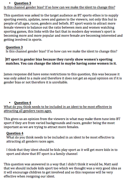
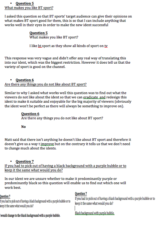
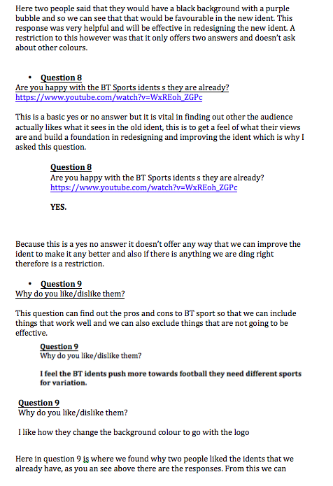
|
What do you think makes a good ident?
Those who we interviewed all answered this question with similar answers. They think an ident should be eye-catching so it can draw the audiences attention in. This then will make the viewers interested and take note of the information being broadcasted. How long do you think an ident should be? The majority of the people we interviewed agreed with a mutual answer that a typical ident should be around 20-30 seconds long. This is so it attracts viewers and shares all relevant information about the channel or programme with them as well as relating to the channels ethos however is not too long that the viewers then get tired of watching or distracted. What colours do you associate with BT Sport? For this question, there were a variety of different answers given due to the different colours used within the current BT Sport logo. The main colour that was mentioned was blue/purple. This is important that we find out what colour stands out to the audience more for when we create our logo and ident so that we can use it for recognition with viewers and still relate the the original BT Sport branding. What age do you reckon the target audience is for BT Sport? The answers we received were from teenagers and above. This is due to teenagers usually being the starting point of children really starting to have a real love for sports. It is important we find out the the target audience interested in sports so that when it comes to creating our ident, we know what sort of age to aim it at. Do you think that current BT Sports idents relate to the channels corporate identity and ethos? Every single person we asked this question to answered yes but for several different reasons. one being that it relates to the channels corporate identity and ethos because the channel is that the idents include clips of different sports which are aired on the channel such as football, rugby, cricket etc.
0 Comments
This ident I 17 seconds long which is a good amount of time as it isn’t too short so that the viewers don’t understand or miss the fact that they are watching something on BT sport. The ident is quite complex in the terms that there is quite a lot of information to take in, there are 4many flashing images of people playing football that last 1-2 seconds, on top of this there are one word writing which means you have to focus on the football and the text at one time. However it is quite simplistic in the terms that it is only sowing football. The target audience is clearly teenagers to middle aged men as it has loud music that is very upbeat and it shows flashing images. The purpose of this ident is to make football on BT sport look epic and worth watching, trying to convey that BT sports airs good and important footballing events. The ident reflects this corporate identity as it says at the end in a clear and slow tone “Scottish premier league football on BT sports” which makes it seem like it is a big event and that it cant be missed. BBC 3’s ident is 9 seconds long which makes it snappy and of a relatively good length as it isn’t too long that the viewers get bored of what they are watching, this would portray the channel s boring itself. The ident is very complex as there are a lot of movements and many colours therefore there is a lot of information to take in for the viewers. The target audience is clearly for teenagers as it has loud rock music and a lot of moving images, therefore it is showing it is fast paced which is what most teenagers like. The purpose of the ident is to show that it is mystical and quirky, which is what they show in their programmes that they play. It does this by incorporating things you would relate to teenagers like shoes, flashing lights and an amp plug. This channel ident reflects the corporate identity as it shouts 3 several times to remind the viewers what they are watching, this shouting shows the identity as teenagers are loud messy and fast paced. This ident is 10 seconds long which would be to short for an older viewer as it wouldn’t be clear what they were watching, however for its target audience it is good as younger viewers attention spans are very low. The target audience for this ident is very young children and this is clear as it used basic and d=few colours with a short lasting image. This design is not complex and is very simplistic as its viewer’s attention spans re low. In the ident a small green blob is splashes against the screen to make it look like it is coming out of the screen, which would entertain a small child. The purpose of this ident is to show that it is child friendly and to entertain the child. This is reflected as it is very simple and uses a child friendly blob that can be related to the liquid looking background of the ident.
|
AuthorWrite something about yourself. No need to be fancy, just an overview. ArchivesCategories |
- Home
-
Music Video
-
Assignment 1
>
- 1.1 The Purpose of Music Videos
- 1.2 Music Genre Conventions
- 1.3 Music Video Styles
- 1.4 Music Video Recipe
- 1.5 Digital Editing Revolution
- 1.6 Editing Case Study
- 1.7 Cinematography Rules
- 1.8 Single Camera TV - Comparative Table
- 1.9 Single Camera Analyse
- 1.10 Meaning Conveyed in Music Videos
- 1.11 Narrative Theory
- 1.12 NME Videos
- 1.13 Music Video Directors & Code of Practice
- 1.14 Record Label Case Study
- Assignment 2 >
- Assignment 3 >
-
Assignment 1
>
- IDENT
 RSS Feed
